 servicing the world!
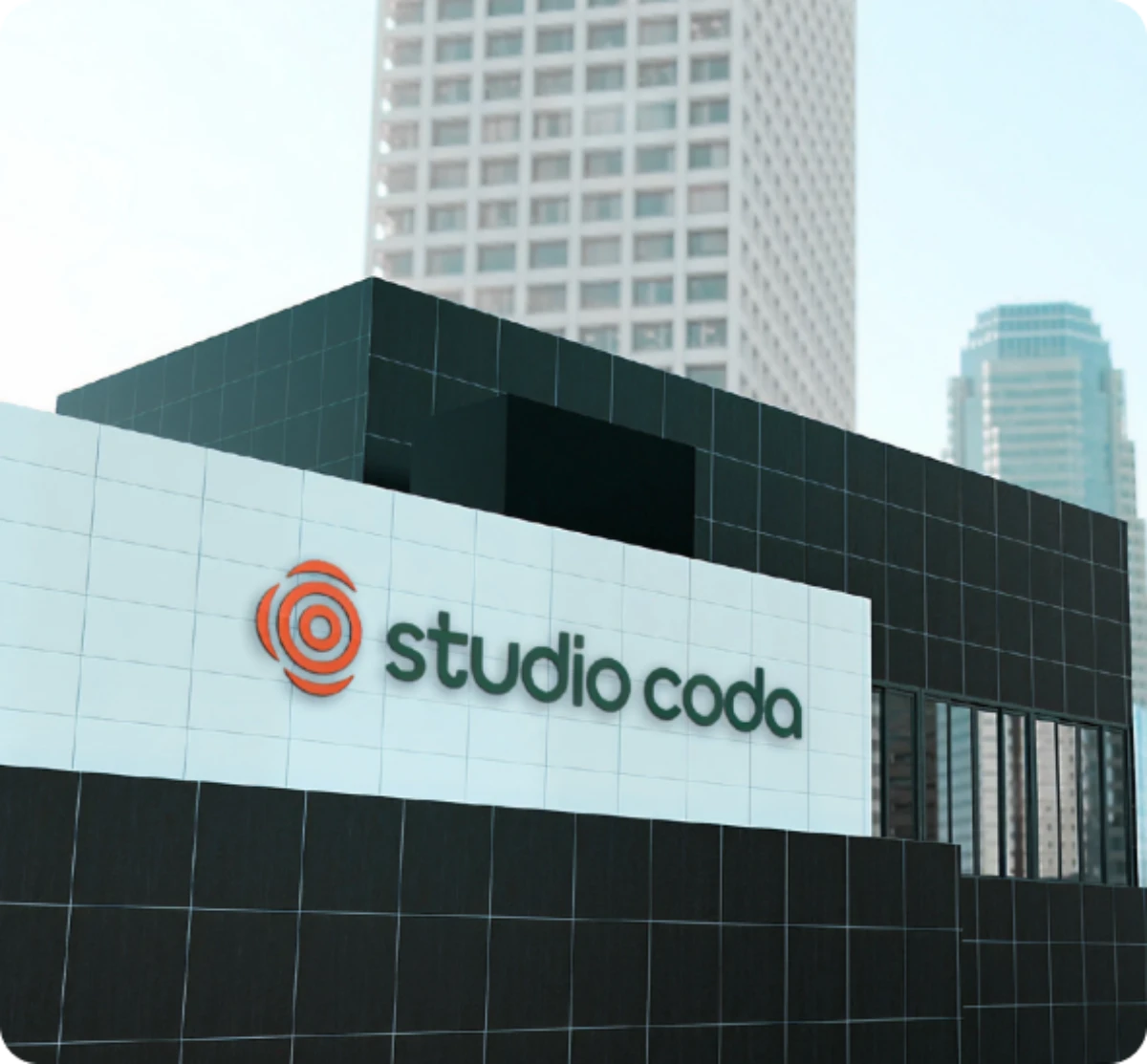
The Client & Challenge
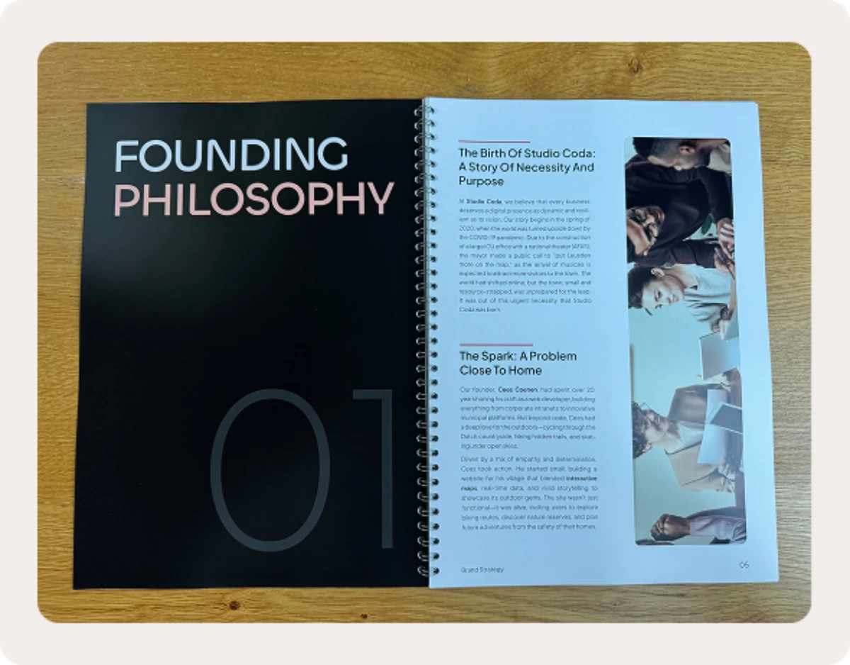
When Cees Coenen set out to launch Studio·coda, he knew he wanted more than a “pretty logo.” As a seasoned web developer and musical conductor, his vision was rooted in harmony—bringing technology, creativity, and strategy together. Yet, his early ideas (a clean wordmark, a musical coda symbol, a visual separator) lacked clarity and positioning. He needed a brand that went beyond visuals to capture his values, attract the right clients, and present Studio·coda as a trusted creative partner—not just another web agency.
Our Approach
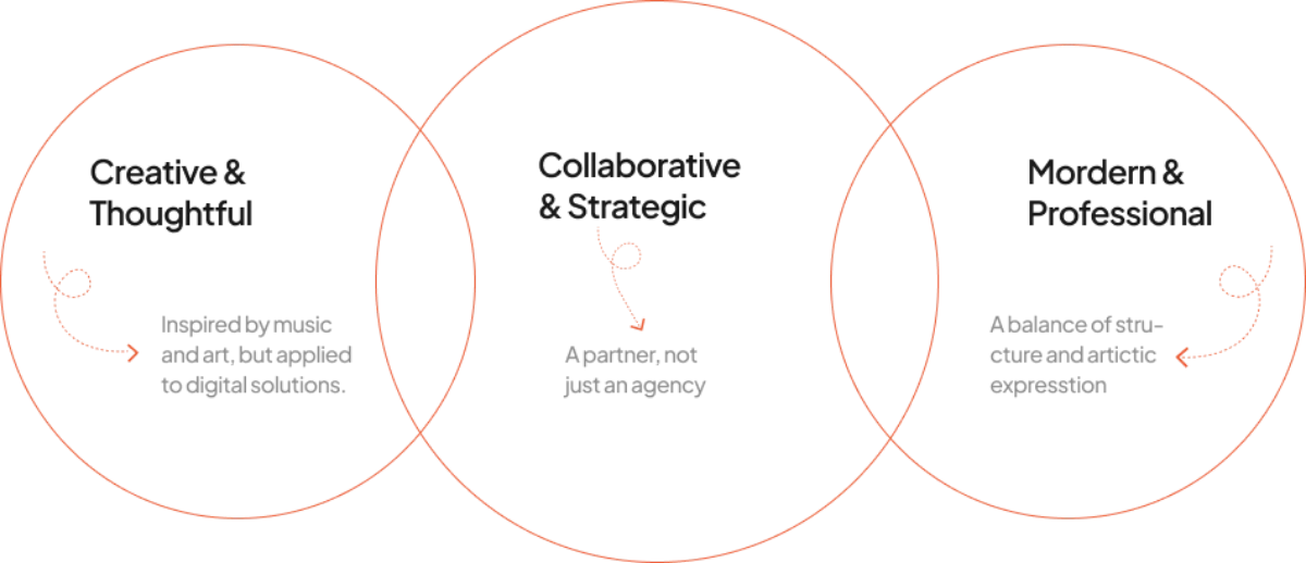
Before sketching logos, we stepped back to ask: What does Studio·coda really stand for? The name itself, borrowed from music, represents a place where themes converge and resolve with intention. This became our foundation: a brand that balances strategy, creativity, and clarity.
Together with Cees, we defined the traits that mattered most:
- Creative & Thoughtful
- Collaborative & Strategic
- Modern & Professional
The Solution
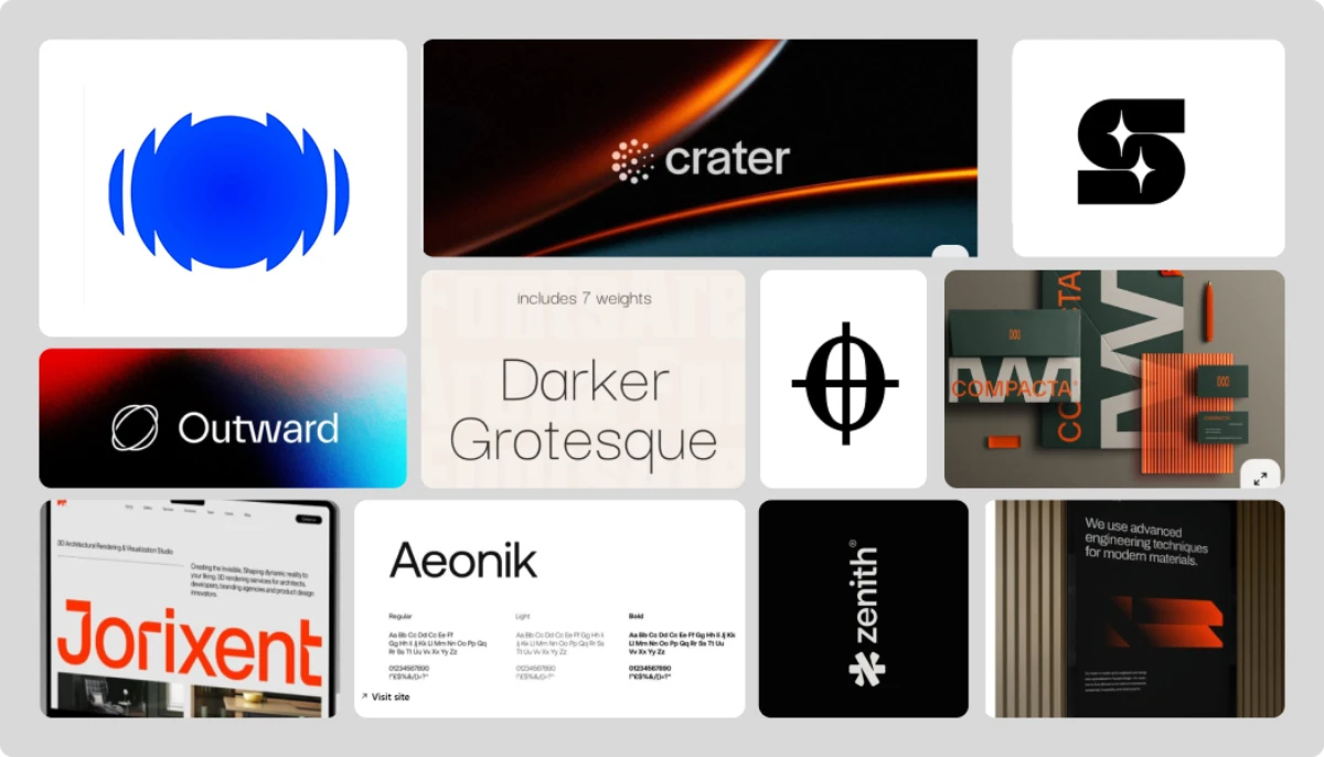
Mood board
We explored several directions, building from Cees’ ideas but grounding them in strategy.
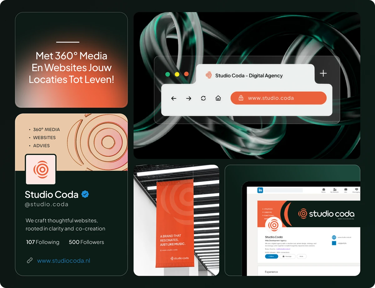
Logo & Visual Identity
We explored several directions, building from Cees’ ideas but grounding them in strategy.
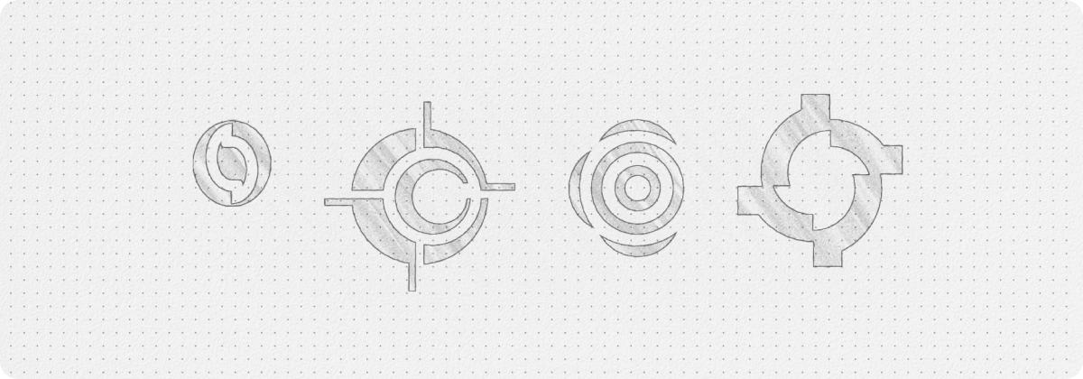
After thoughtful discussion, one direction clearly stood out. A design that combined precision and warmth, artistry and structure. That became the foundation of Studio·coda’s identity.
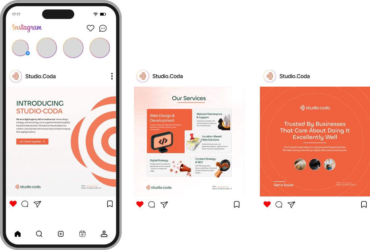
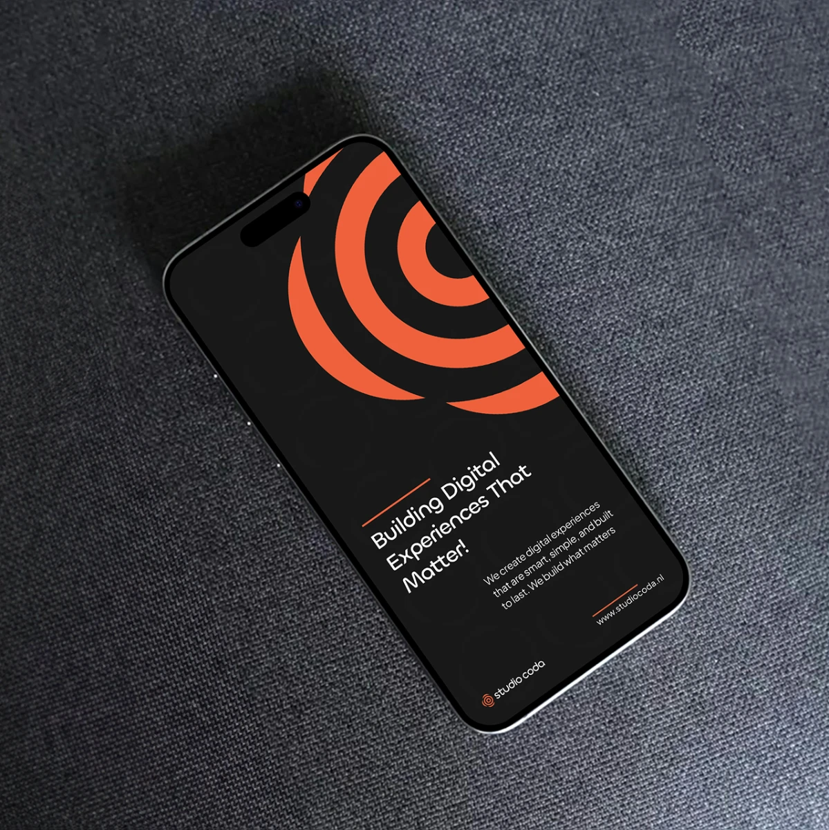
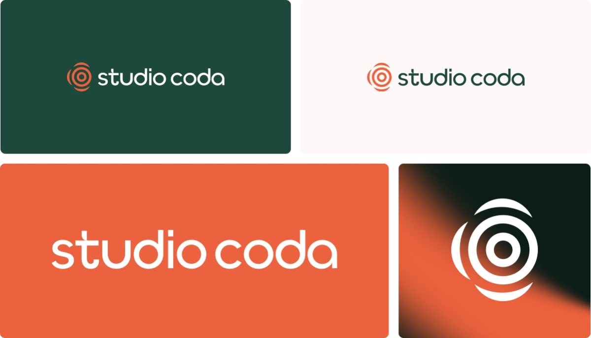
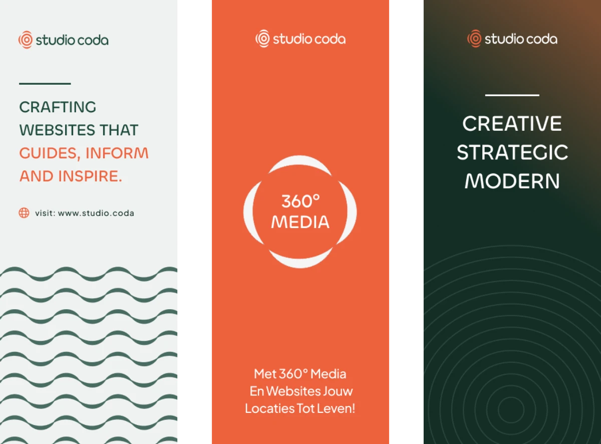
The final logo was a clean, rounded wordmark paired with a ripple-inspired mark that reflects sound, co‑creation, and flow.
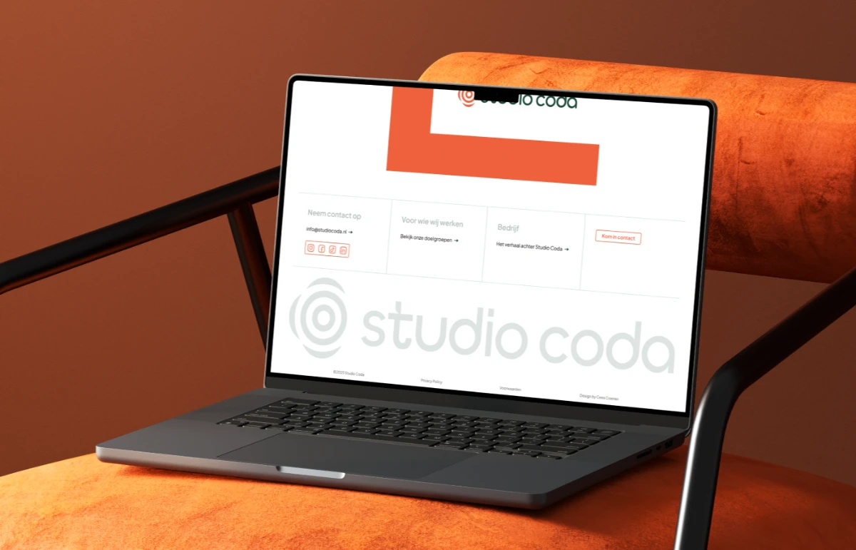
Color & Typography
Most digital agencies default to “safe” blues. We went bolder:

- Orange – vibrant, confident, creative.
- Green – stable, natural, linked to tourism and sustainability clients.
- Black – professional, timeless.
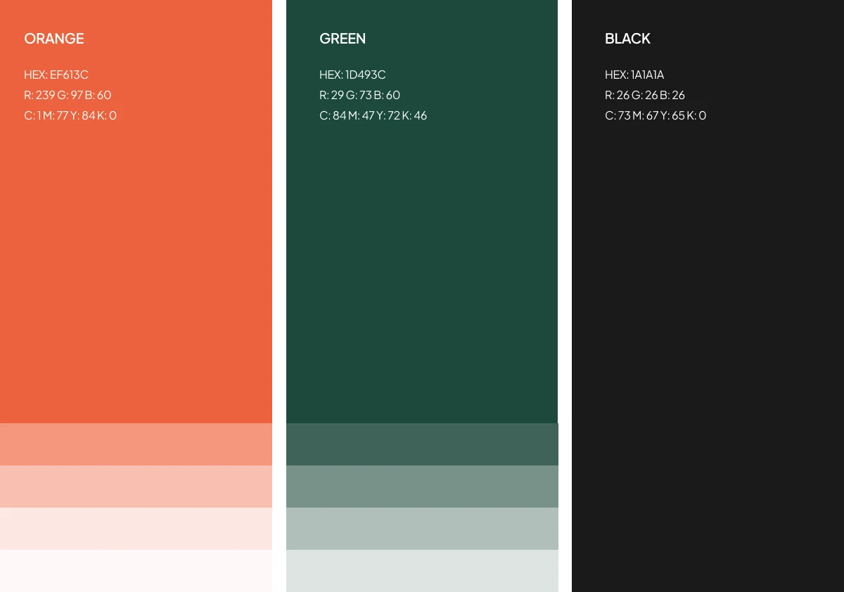
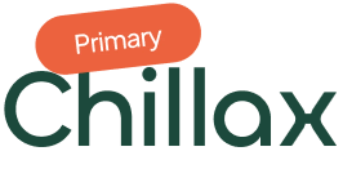
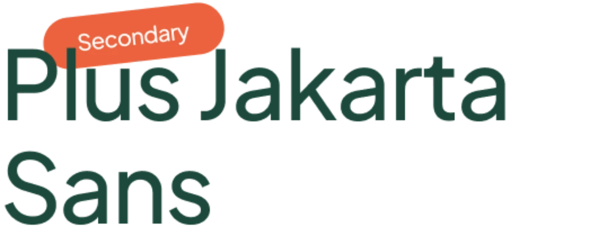
For typography, we paired Chillax (rounded, approachable) with Plus Jakarta Sans (clear, versatile). Together, they reinforced Studio·coda’s personality: structured yet human.
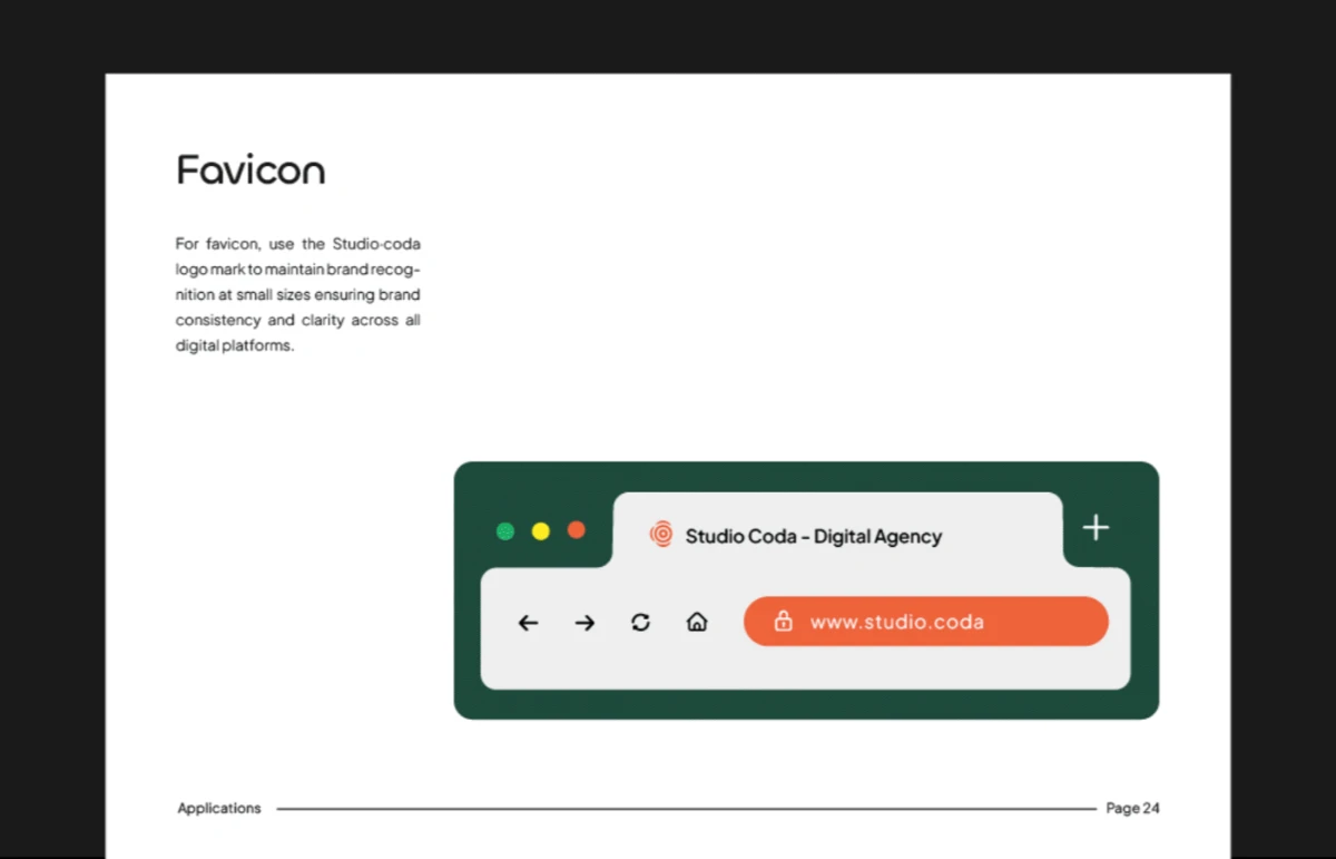
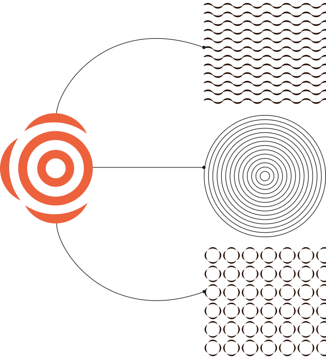
Patterns & Guidelines
To extend the brand beyond the logo, we created a flexible system of patterns inspired by rhythm, co‑creation, and structure. Paired with simple brand guidelines, Studio·coda gained the tools to stay consistent across web, print, and client projects.
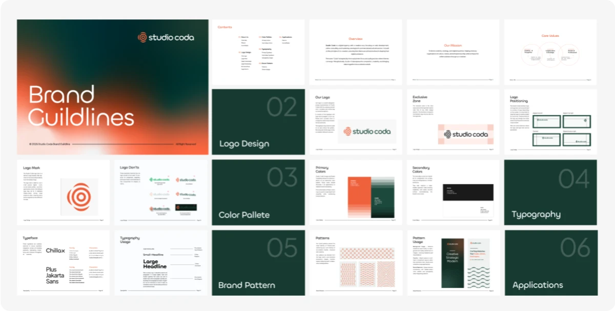
Brand Guidelines
Once the core identity was in place, logo, typography, color etc. We created a practical brand guideline to ensure Studio Coda could maintain visual consistency as it grew
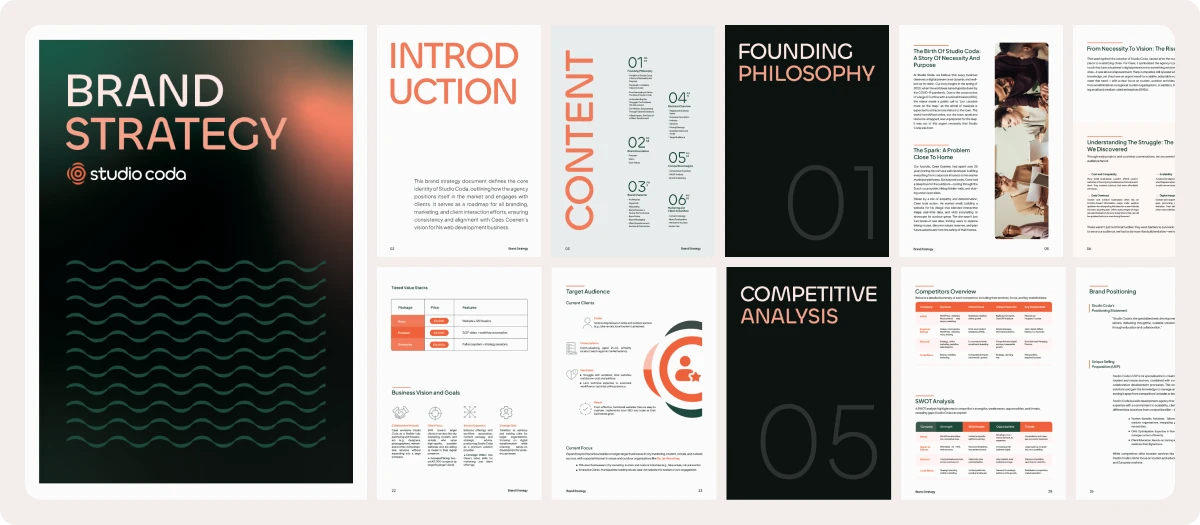
Strategy Beyond Design
The strategy process typically comes first, but Cees was not convinced he needed it, We see this sometimes with some clients where they are not convinced of the value of Brand Strategy, but from the depth of our conversations and the clarity clients get from our design process, they realise that strategy is a no brainer.
What began as a visual identity project grew into a full brand strategy roadmap.
We defined Studio·coda’s purpose, values, and positioning, clarified its audience, and shaped a clear voice. This strategy document now guides both communication, team/collaborator relationship and client acquisition.
The Results
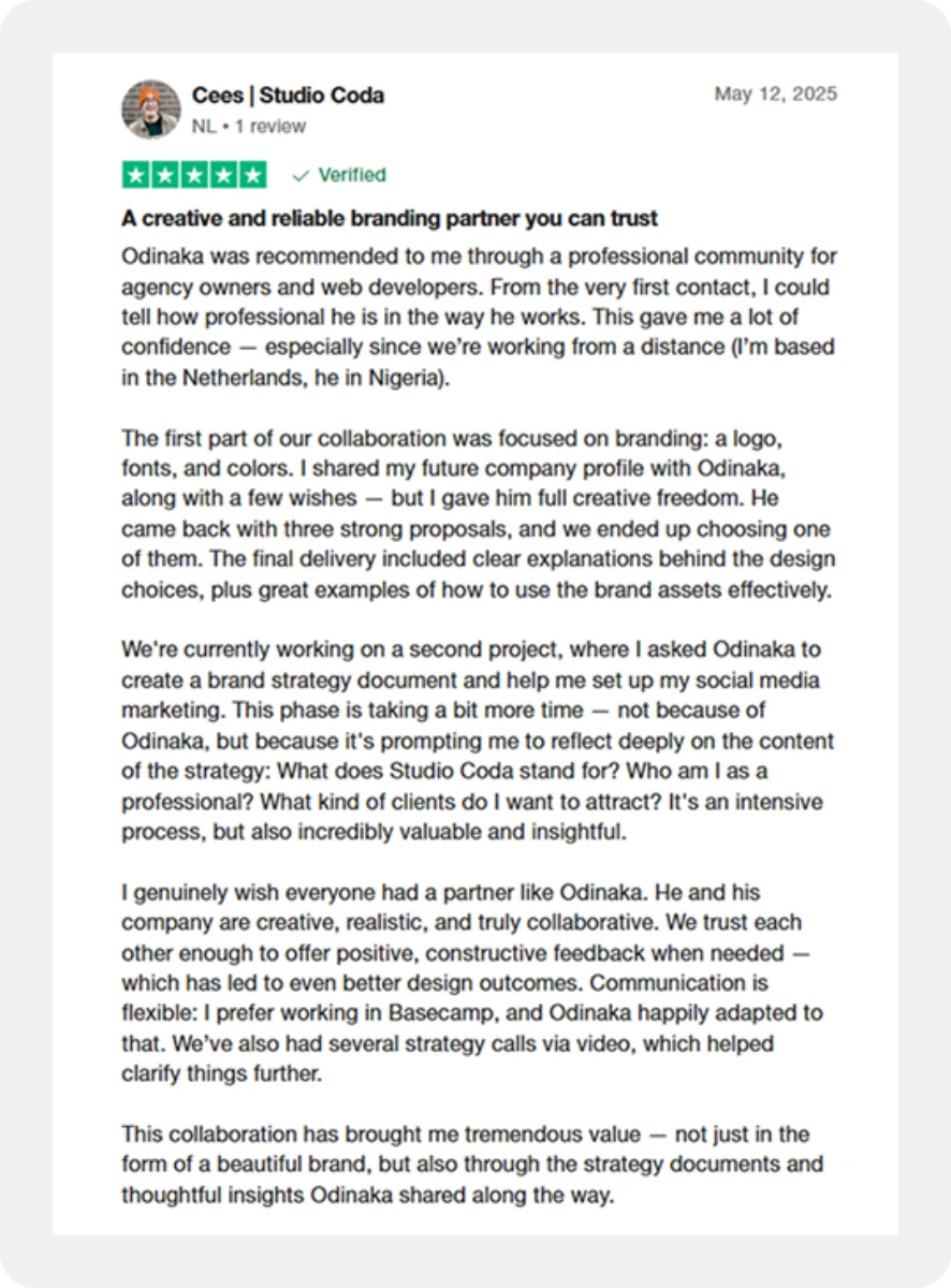
Cees described our partnership as “creative, realistic, and truly collaborative”. Our process gave him better understand and communicate the Studio·coda brand. He noted:
“I genuinely wish everyone had a partner like Odinaka..”
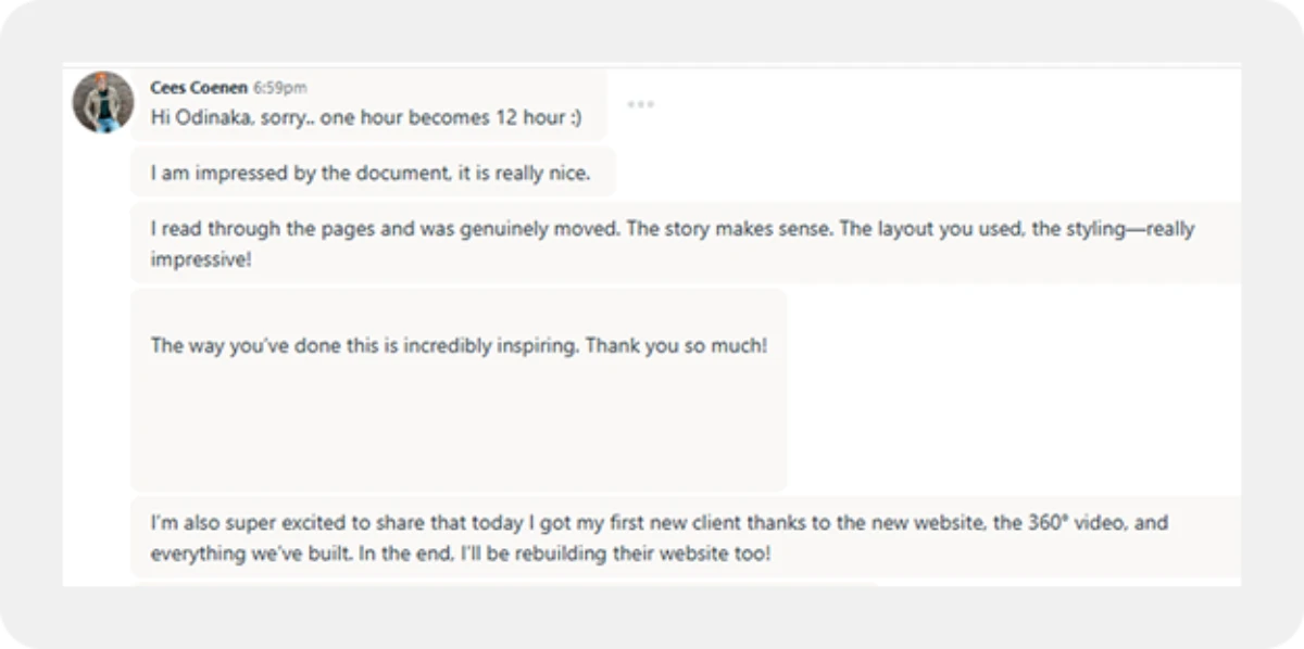
Oh, and he got a client from the new messaging on the agency website within 12 hours
Ready to Scale Your Personal Brand or Agency?
If you’re a web professional or small agency owner like Cees, and you want your brand to reflect your true value, let’s talk. Together, we’ll craft an identity and strategy that attracts premium clients and positions you as a leader in your space.